Somewhere in your organization, two teams are solving the same problem with different tools. One chose a message queue last quarter; another chose a different one this week. No one made a bad decision in isolation—they just made decisions without shared context.
A Tech Radar solves that. It doesn't lock choices down; it makes your technology decisions visible and deliberate.
What a Tech Radar Actually Is
The concept was popularised by Thoughtworks in 2010 as a way to visualize the technologies an organization interacts with. The original format plots "blips" (technologies) on a circular chart divided into quadrants and rings, giving leadership and engineering a shared picture of what's in play and where it's heading.
A Tech Radar makes technology choices visible. It turns what only senior engineers know into knowledge the whole organization can use.
The Rings: Where Each Technology Stands
The rings are the core of a radar. They show each technology's lifecycle status—not quality, but a strategic signal of future use.
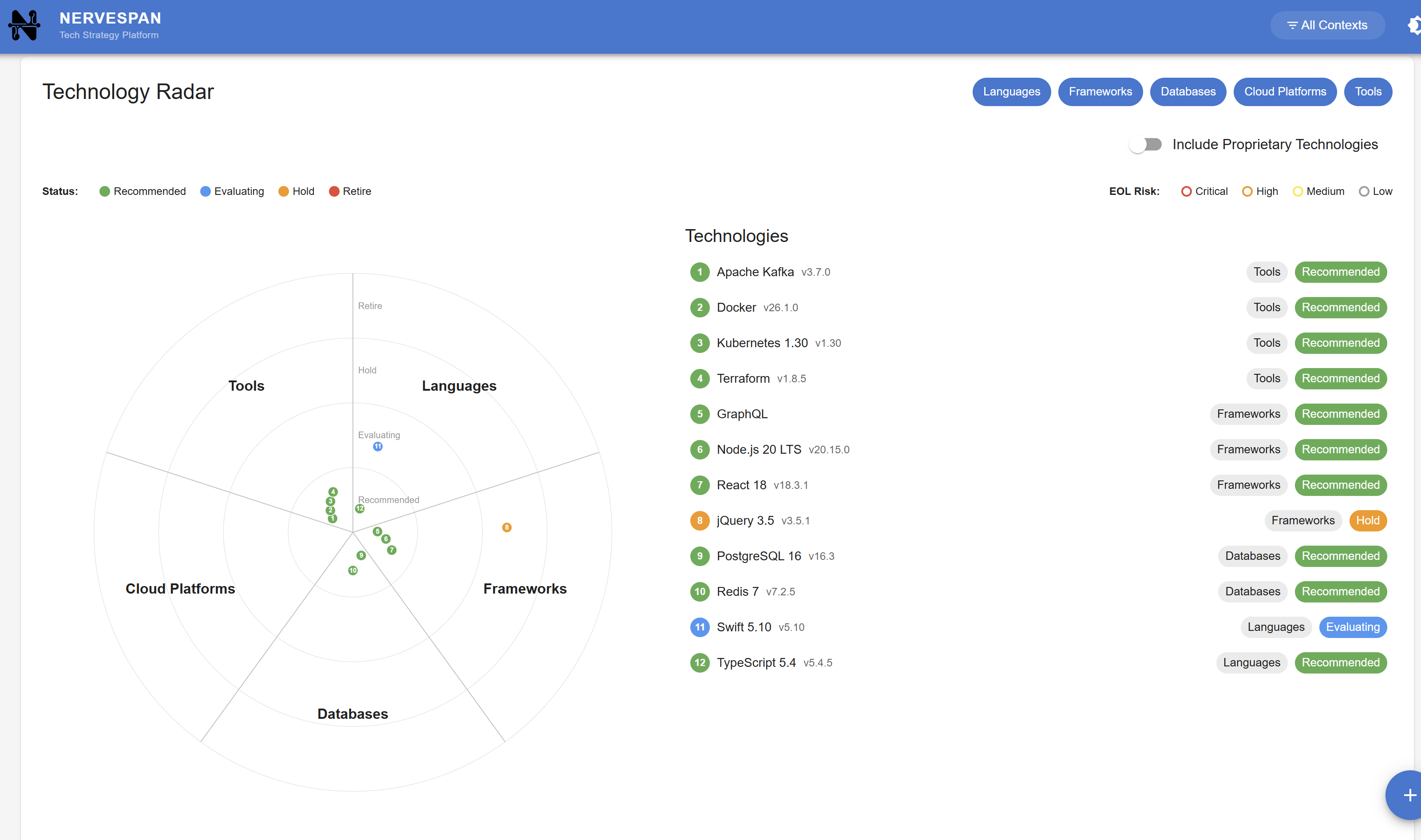
In Nervespan, the technology radar uses four rings:
Recommended — the inner ring. These are your defaults. Proven, well-understood, and supported. When a team starts a new project, these are the technologies they should reach for first. Being here doesn't mean "best in class" — it means the organization has confidence in them and is willing to invest in them long-term.
Evaluating — the next ring out. These are technologies the organization is exploring. They show promise but lack full confidence. Teams may try them in low-risk contexts — such as a new internal tool or a non-critical service — to build experience and gather evidence before committing to them more broadly.
Hold technologies aren't bad, but new work with them hasn't started. A better alternative may exist, or the ecosystem is stagnating. Use what's built, but don't add more.
Retire — the outer ring. These are being actively removed. A migration path should exist, and the goal is to reduce exposure. Any component still running on a retired technology carries a known risk.
The Segments: Organizing by Category
The rings show status. The segments show the type. Dividing technologies makes the radar easier to read when there are many entries.
Nervespan uses five segments:
- Languages — the programming languages in your stack (Python, TypeScript, Java, Go)
- Frameworks — the libraries and frameworks built on top of those languages (React, Spring Boot, Django)
- Databases — your data stores (PostgreSQL, Redis, MongoDB, Snowflake)
- Cloud Platforms — the infrastructure you run on (AWS, Azure, Kubernetes, Cloudflare)
- Tools — everything else that supports development and operations (CI/CD pipelines, observability platforms, code scanners, IDEs)
Together, rings and segments give a clear view: you can easily see your database layer is mostly Recommended with one Hold, or that your tooling segment has three in Evaluating and none in Retire.
The Component Radar: A Different Lens
Most people think of tech radars as a tool for managing technologies. But the same visualization pattern works just as well for your component portfolio — the applications, services, and infrastructure that make up your architecture.
Nervespan includes a Component Radar alongside the technology one. It uses the same circular layout but with different rings and segments that reflect the lifecycle of a component rather than a technology:
The rings map to component status: Development, Trial, Active, Stable, At Risk, Legacy, and Retiring. The segments map to component type: Applications, Services, Databases, Infrastructure, and External Systems.
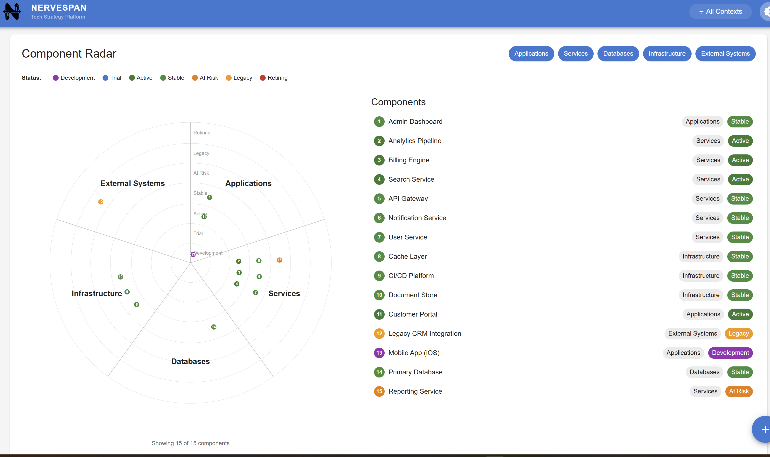
This gives you a portfolio-level view of your architecture. You can see how many components are in active, healthy states versus those drifting toward legacy or retirement. It's the kind of visibility that's hard to get from a spreadsheet or a Confluence page, and it answers the question that leadership often asks: "What shape is our architecture actually in?"
The two radars complement each other. The technology radar tells you what tools you're investing in. The component radar tells you what you've built with them and how those things are aging.
Why This Matters Beyond Engineering
A Tech Radar isn't just an engineering tool; it helps teams share knowledge and align decisions.
When a CTO explains to the board why migration is needed, a radar showing half the stack in Hold and Retire is more convincing than a list of version numbers. When a new team lead joins and asks, "What should I use?", the radar gives an answer based on organizational consensus, not personal opinion.
It also creates accountability. If a technology is in "Evaluating", someone should be evaluating it — running a pilot, gathering data, forming a recommendation. If something is in Retire, there should be a plan to move off it. The radar makes these commitments visible, which makes them harder to ignore.
From Radar to Health: Closing the Loop
A static tech radar just shows strategy—not whether it's followed.
This is where the radar becomes actionable. In Nervespan, the technology lifecycle status feeds directly into component health scores. When a component relies on a technology in the Hold or Retire ring, that dependency signals risk. It doesn't just sit on a chart—it affects the composite health score leadership uses to prioritize investment.
That connection changes the conversation. Instead of "we should probably migrate off that old framework at some point," it becomes "these three components are carrying a health penalty because they depend on a retired technology, and here's the impact." It turns a strategic intention into a measurable signal.
If you want to go deeper on this — how to turn a static radar into a living governance tool — we've written about that in The Living Architecture: Why Your Tech Radar is Lying to You.
Getting Started
You don't need a perfect radar on day one. Start with what you know:
Map what you have. List the technologies your teams actively use. Don't worry about being exhaustive—start with production runtimes, core frameworks, primary data stores.
Assign a ring. For each technology, decide where it sits today. Is it something you'd recommend for new work? Something you're evaluating? Something you'd rather teams stopped adopting? Something you're actively moving away from?
Make it visible. A radar that lives in someone's head or a private document isn't doing its job. Share it with engineering, review it in architecture forums, reference it in ADRs. The value comes from shared understanding, not from the chart itself.
Review regularly. Technologies move between rings. Set a cadence and treat reviews as strategic, not admin.
Connect it to your components. A radar, in isolation, tells you what you think of your technologies. Connecting it to your component portfolio tells you what's actually happening. Which components depend on Hold technologies? Which ones are still running on something you decided to retire a year ago? That's where the radar stops being theoretical and starts driving decisions.
The goal isn't just a beautiful chart. It's to gain practical benefits: a living understanding that helps teams make better decisions, reduces risk, and empowers leaders to steer their architecture in ways that benefit the whole organization.
Ready to make your technology strategy operational?
nervespan helps CTOs and architects plan, manage, and communicate technology strategy with confidence.
Start Free Trial